

Overview
VICODEC runs a school, a technical training institute, a medical centre and a social work team for the families it serves. We rebuilt its identity around one line, Creating Pathways. Changing Lives., then carried it into brochures, signage, uniforms, stationery and a new website.
The challenge
VICODEC had grown from a small self-help project into a school, a technical training institute, a medical centre and a social work team. Its identity had not kept up.
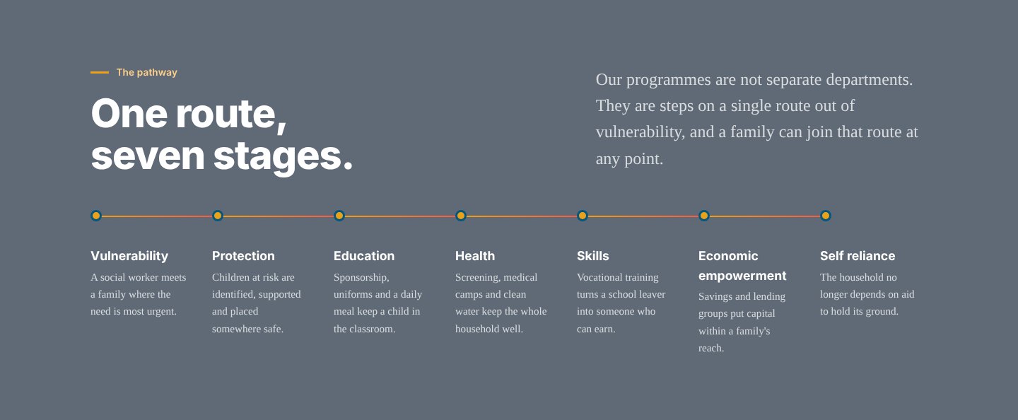
Each part of the organisation looked and spoke differently, so the thing that makes VICODEC unusual was hard to see: every programme is a step on the same route out of vulnerability.
The identity
The new mark puts people at the centre: a figure lifting upward beside a bold, wide wordmark, in deep blue, coral and gold.
The line that holds it together is Creating Pathways. Changing Lives.
- Primary and secondary lockups, for light and dark grounds
- Deep blue as the ground, coral and gold as the energy
- A sweeping ribbon, taken from the brochures, used as a structural device
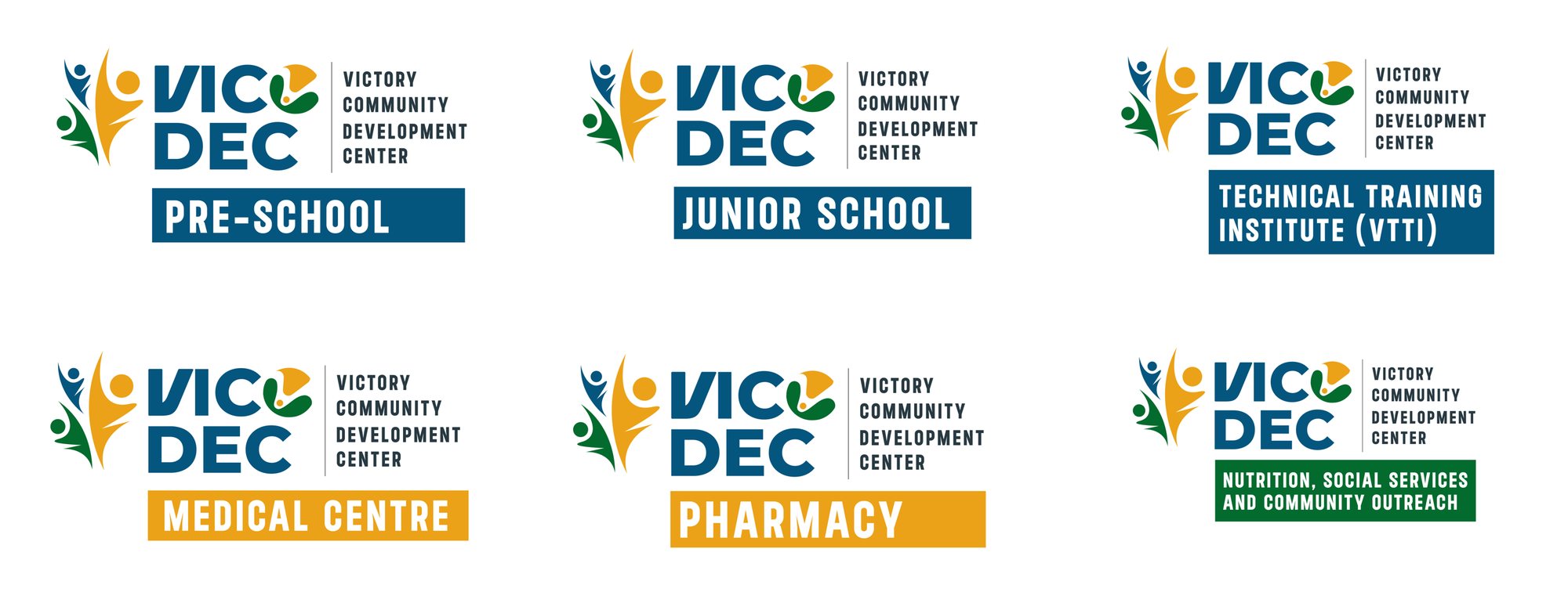
One family of sub-brands
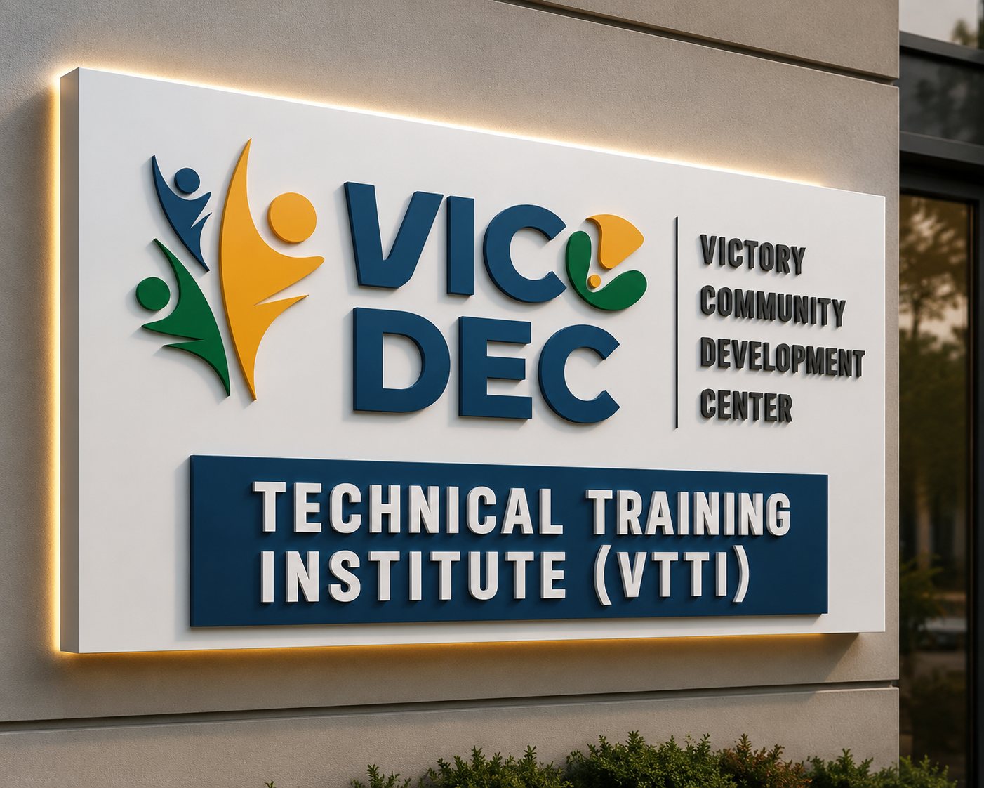
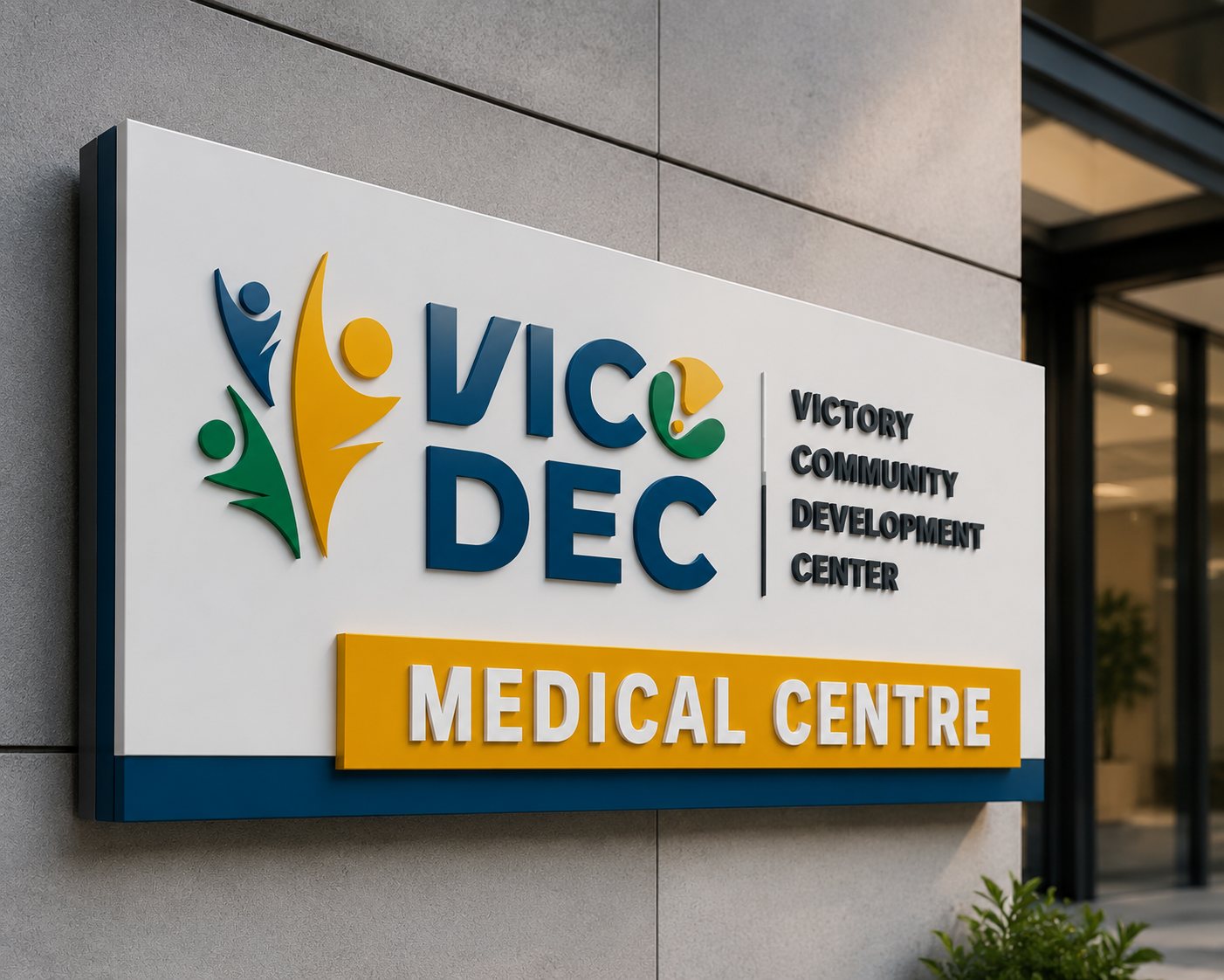
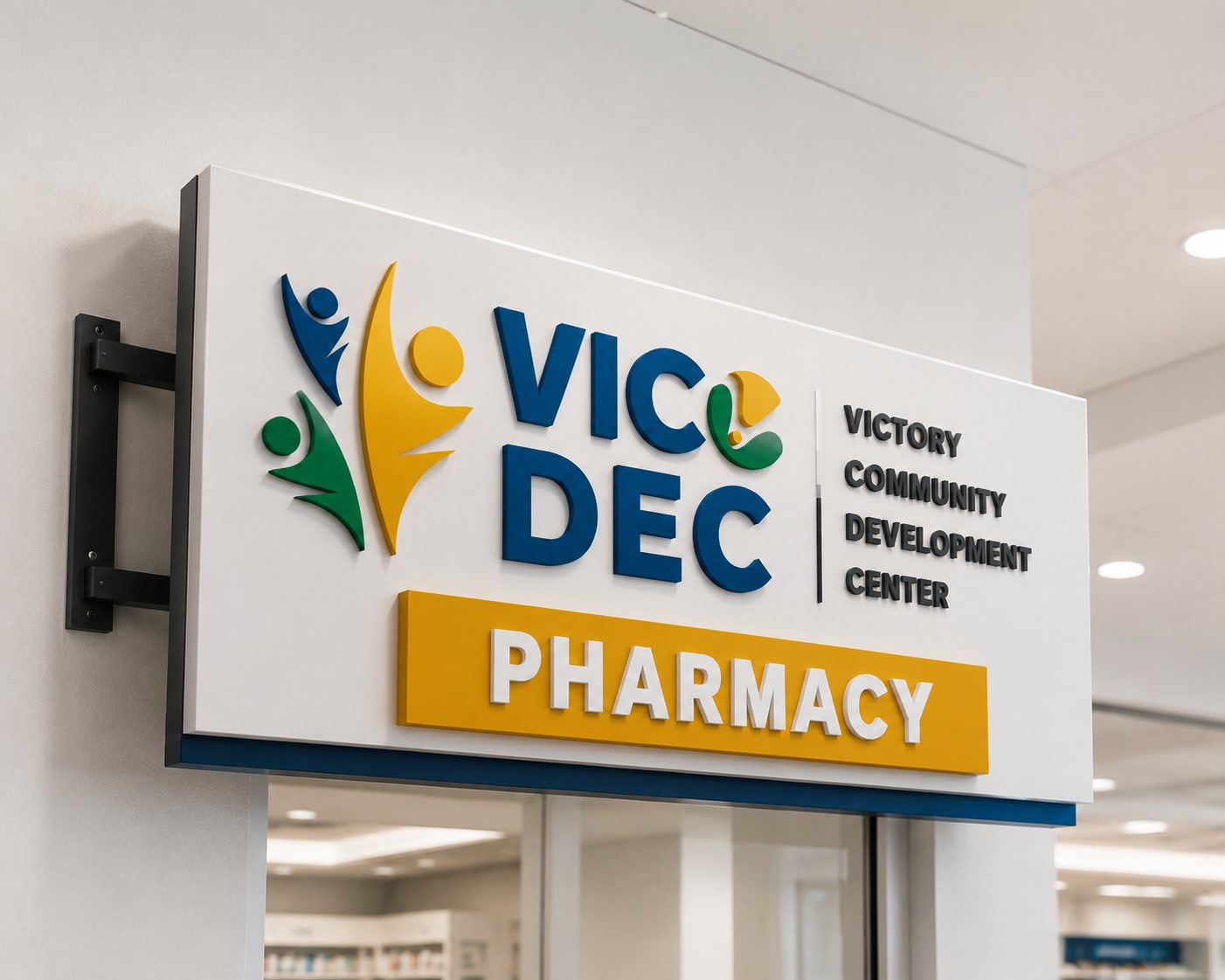
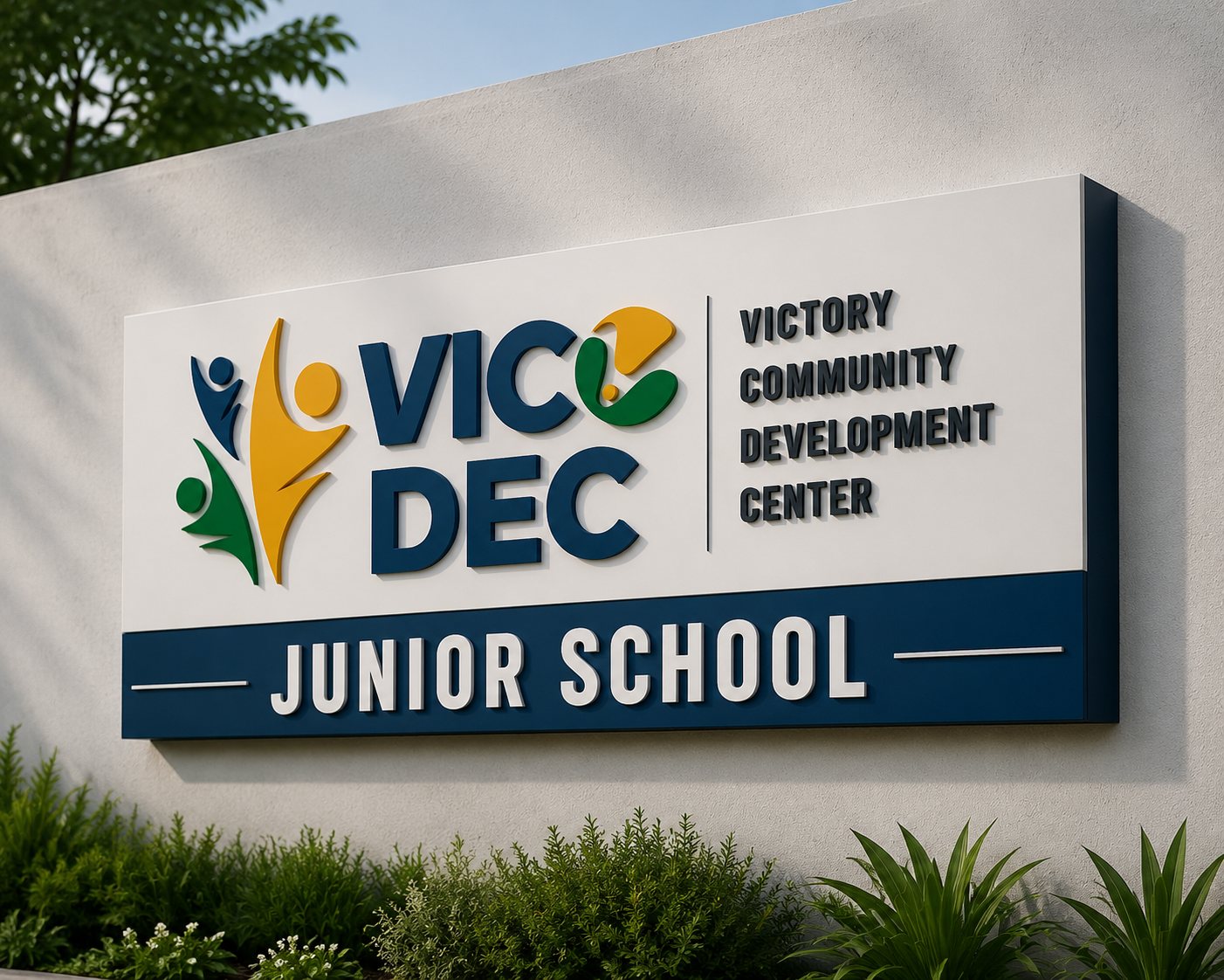
Each part of VICODEC gets its own lockup from the same system, so a parent, a patient or a partner always knows they are dealing with one organisation.
- Pre-School and Junior School
- Technical Training Institute (VTTI)
- Medical Centre and Pharmacy
- Nutrition, Social Services and Community Outreach
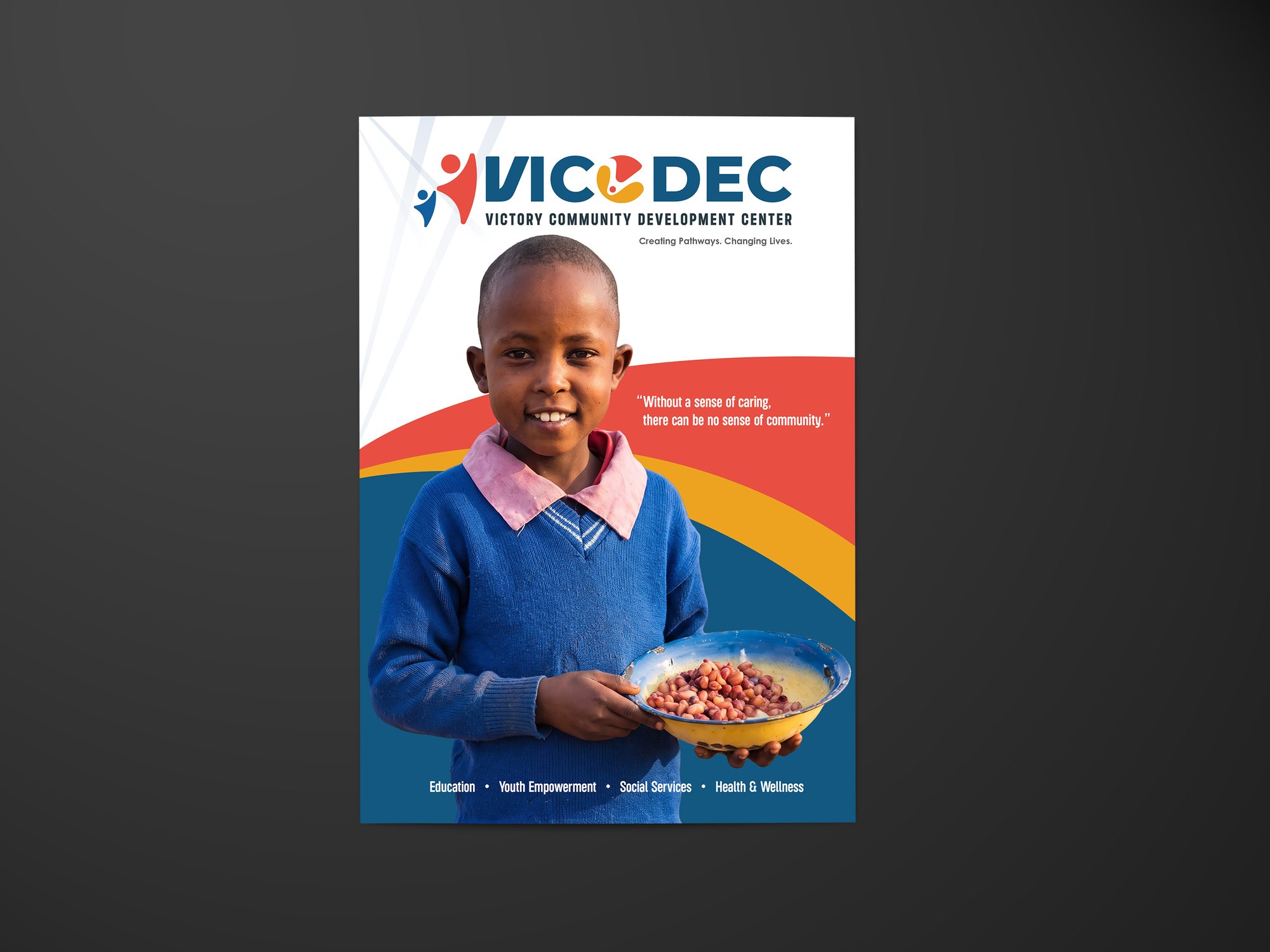
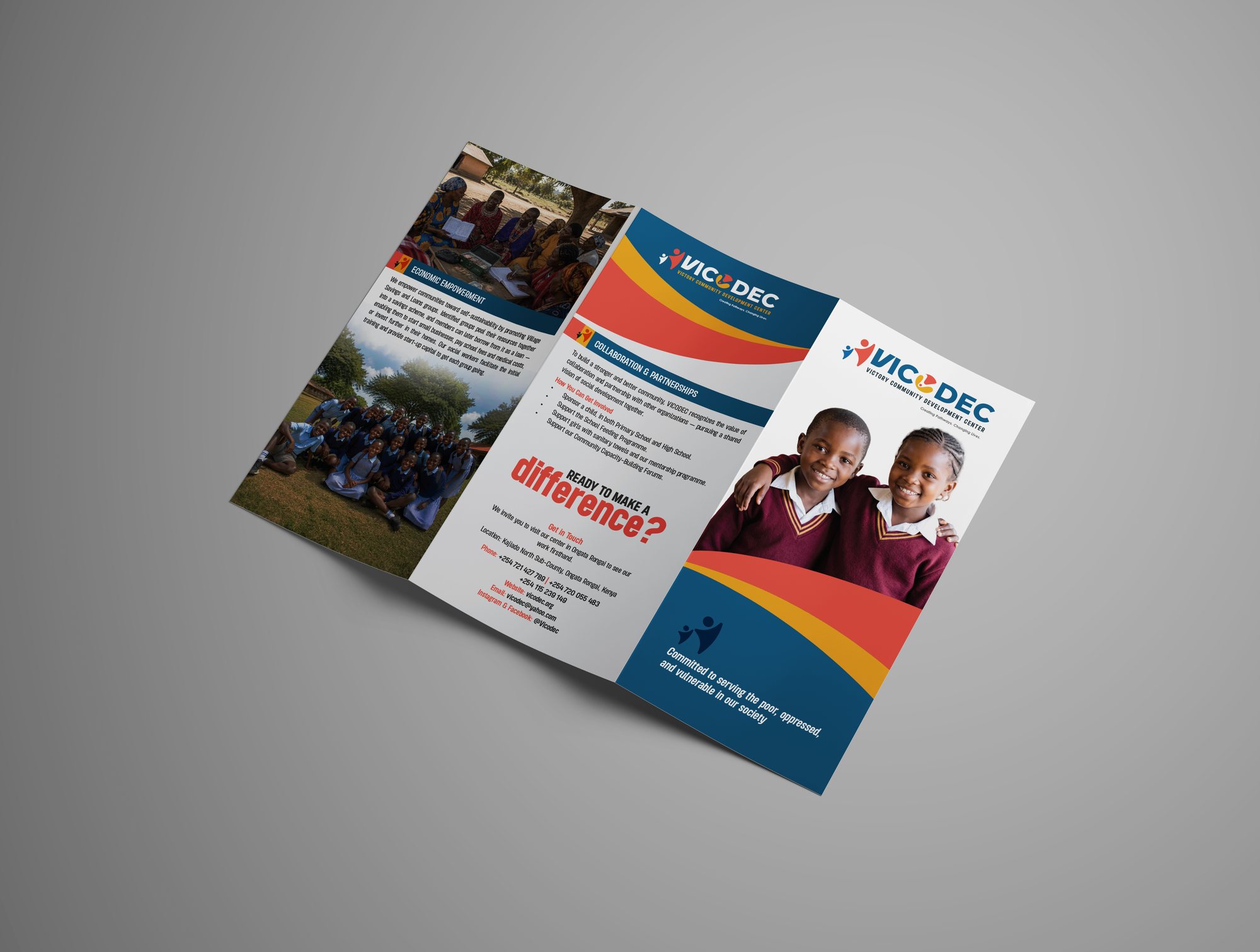
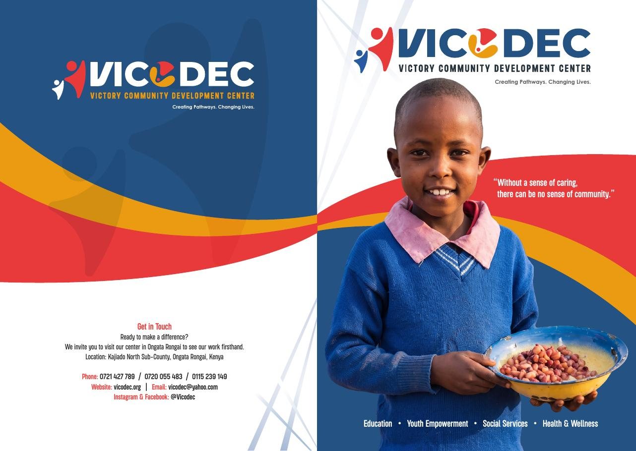
In print
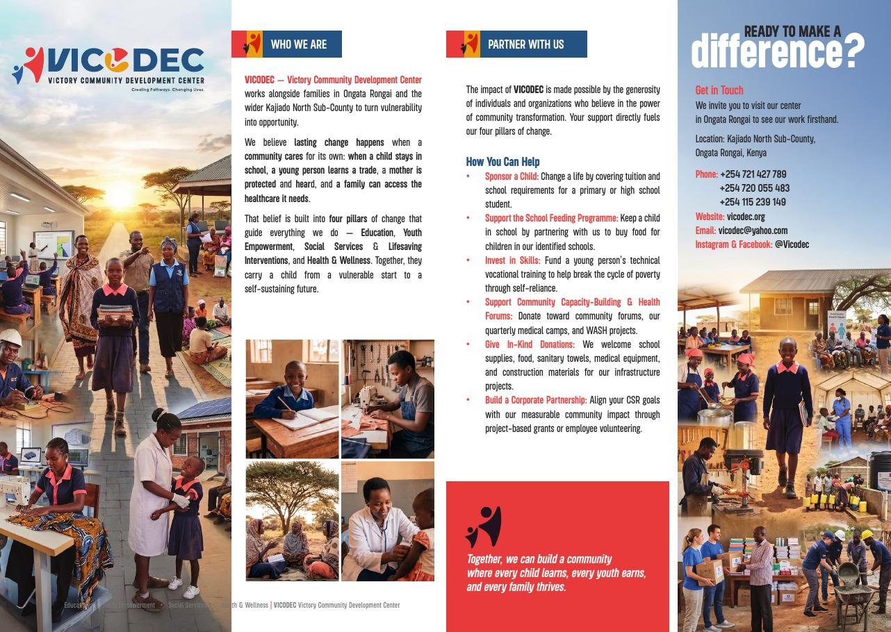
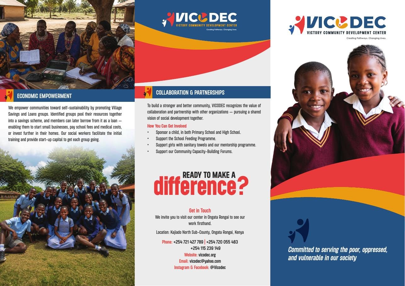
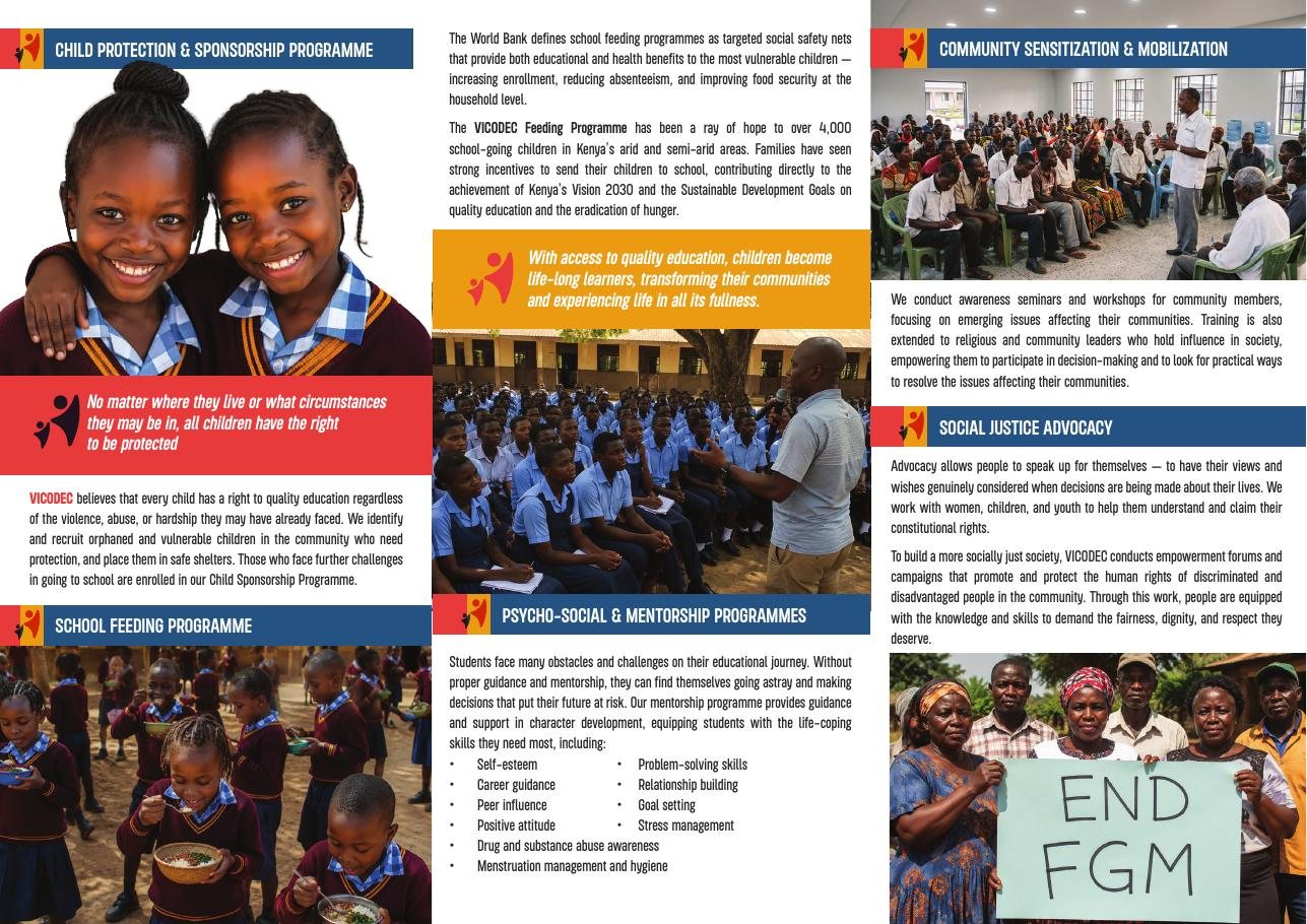
Two brochures became the source of truth for the rebrand: who VICODEC is, the four pillars of its work, and the ways people can support it. Everything that followed, website included, took its messaging and look from them.
Worn and used daily
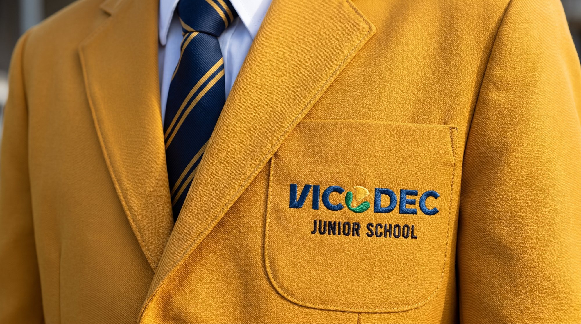
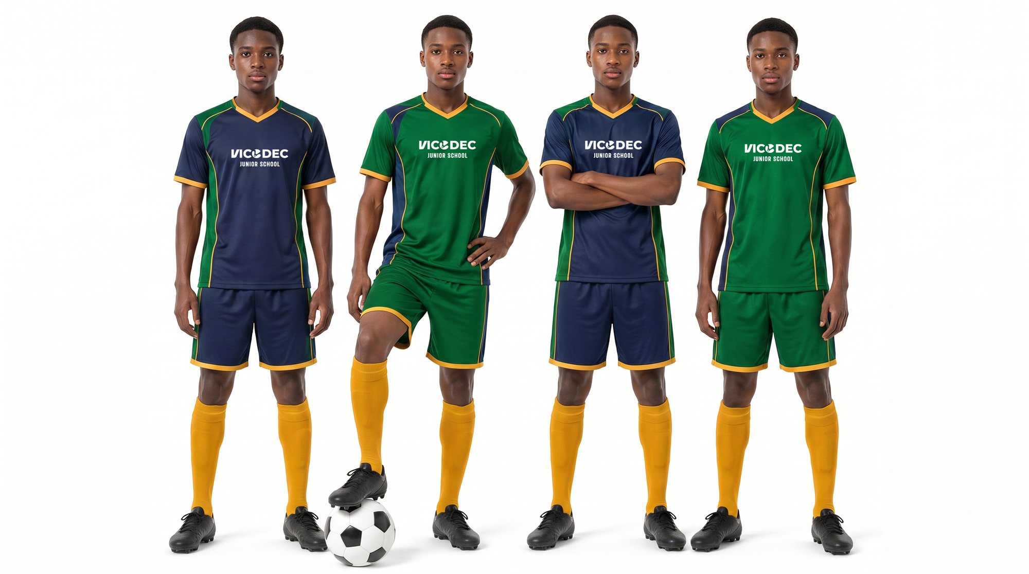
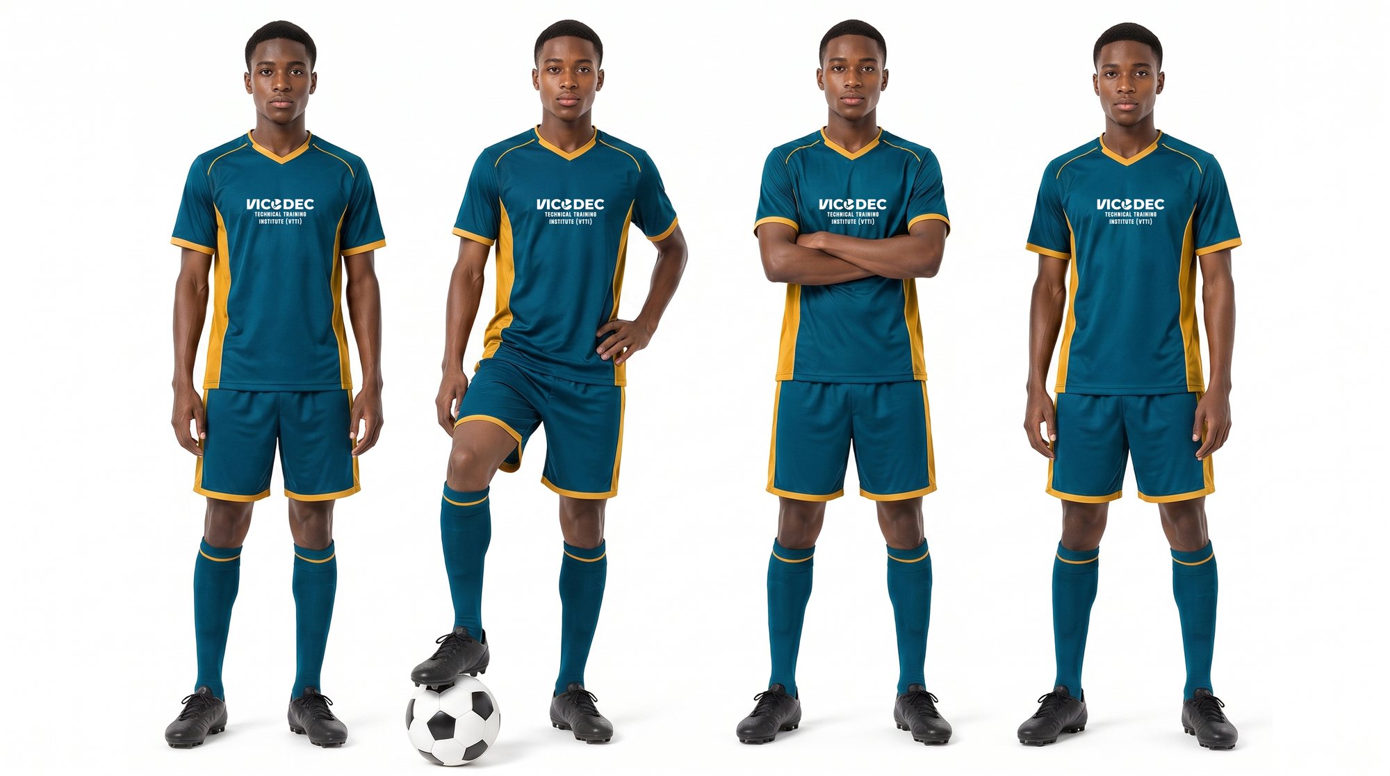
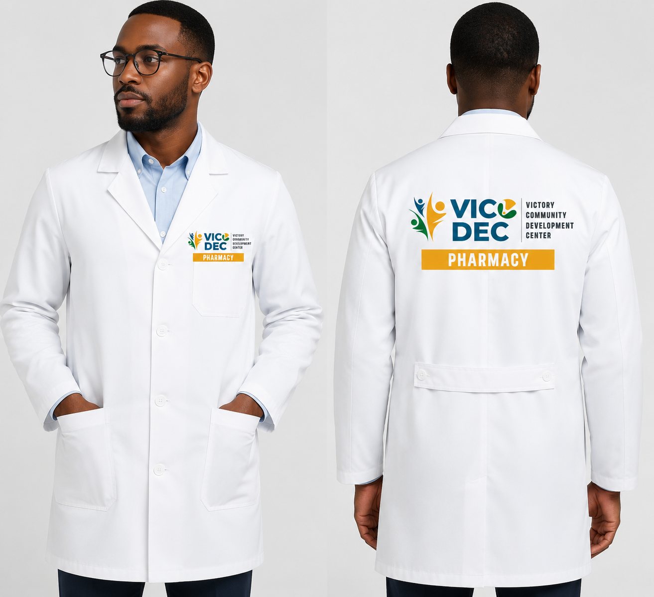
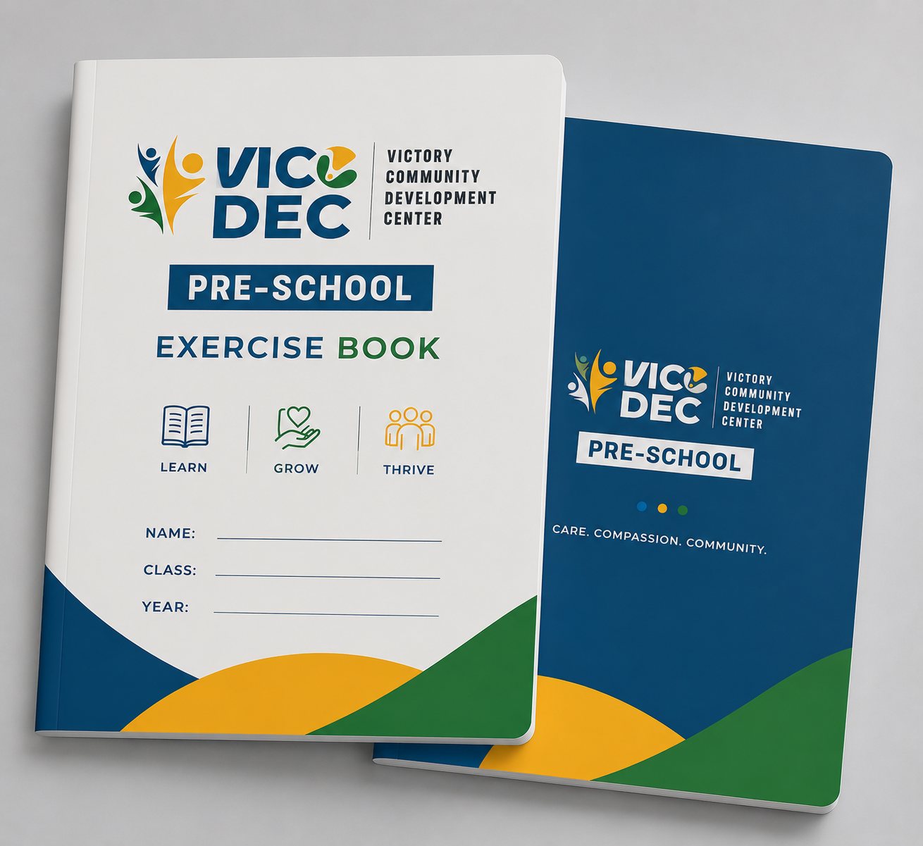
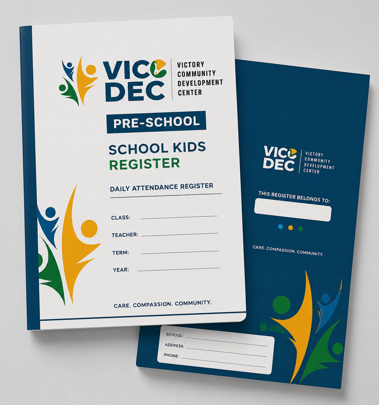
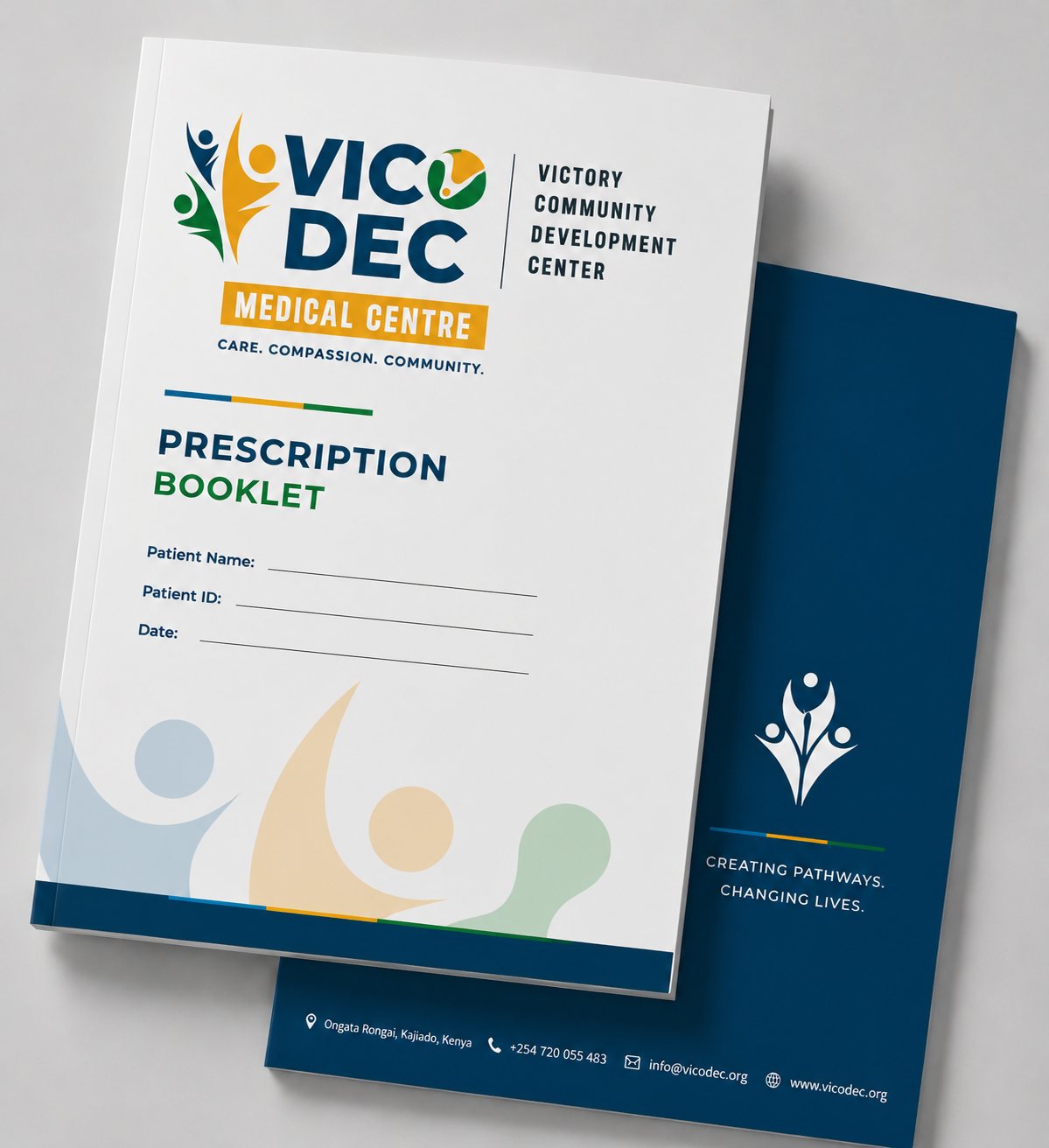
The identity had to work on the things the community actually touches: blazers and football kits, a doctor's coat, exercise books, a class register and a prescription booklet.
The website
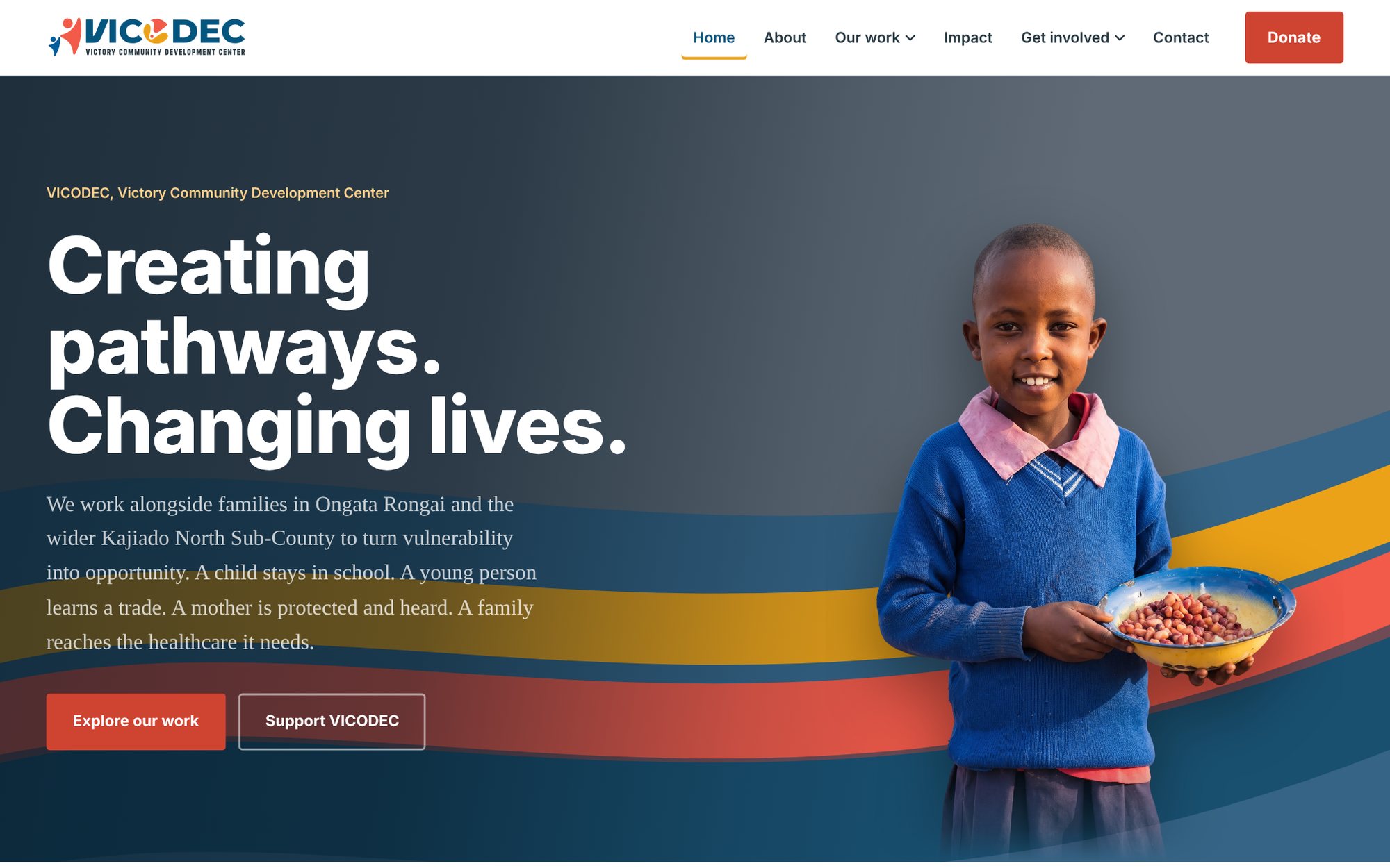
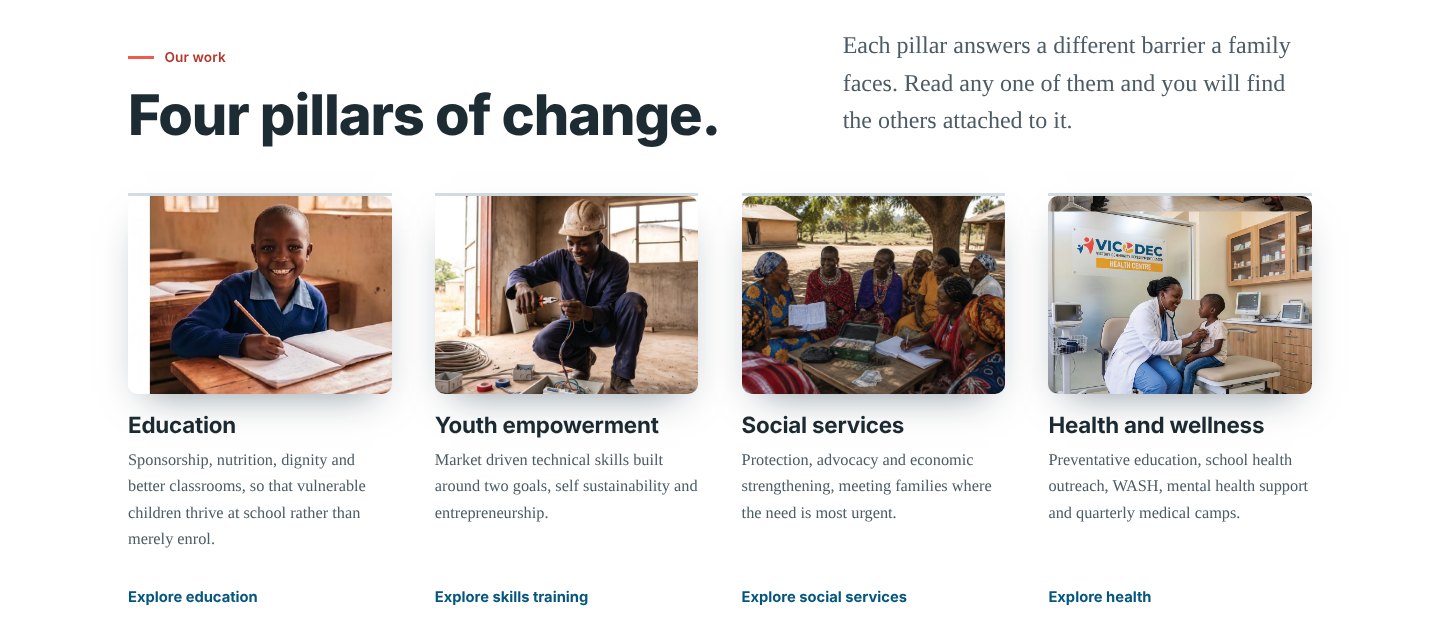
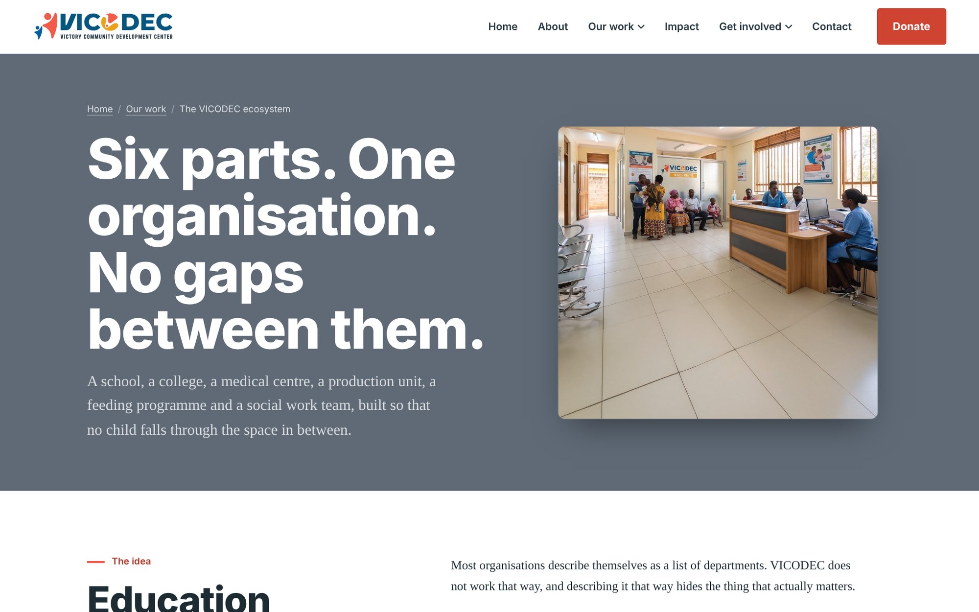
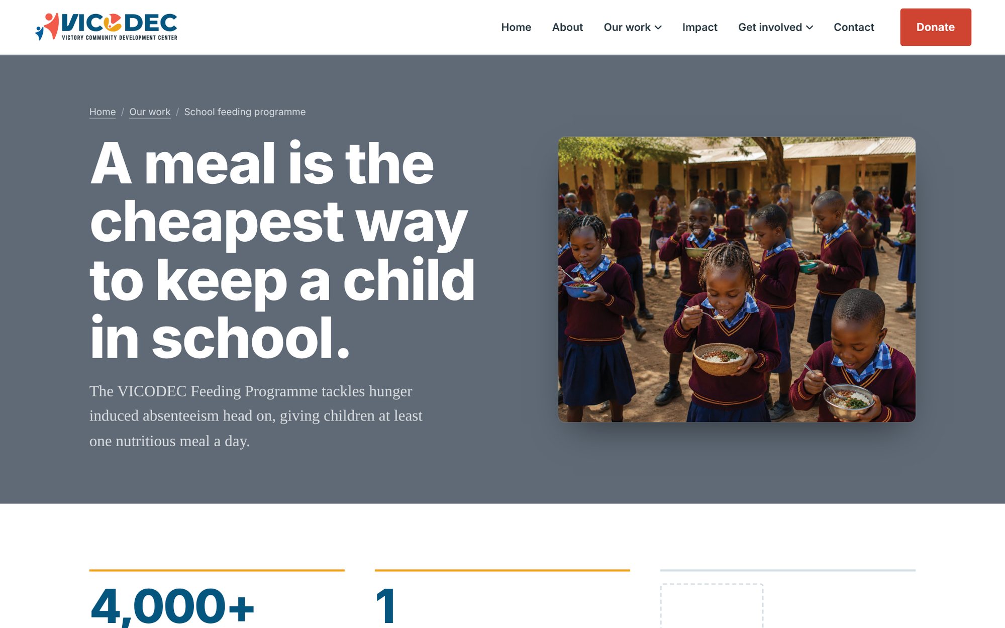
A new multi-page website replaces the old one, with pages for the school, the institute, the medical centre, the feeding programme, social work, impact and ways to give.
The brochure ribbon opens the hero and divides each section. An interactive ecosystem module shows how the six parts of VICODEC connect, and the site was built to be handed over to VICODEC's own team to run.
What was delivered
- New primary and secondary logo
- Sub-brands for the school, institute, medical centre, pharmacy and outreach
- Two brochures
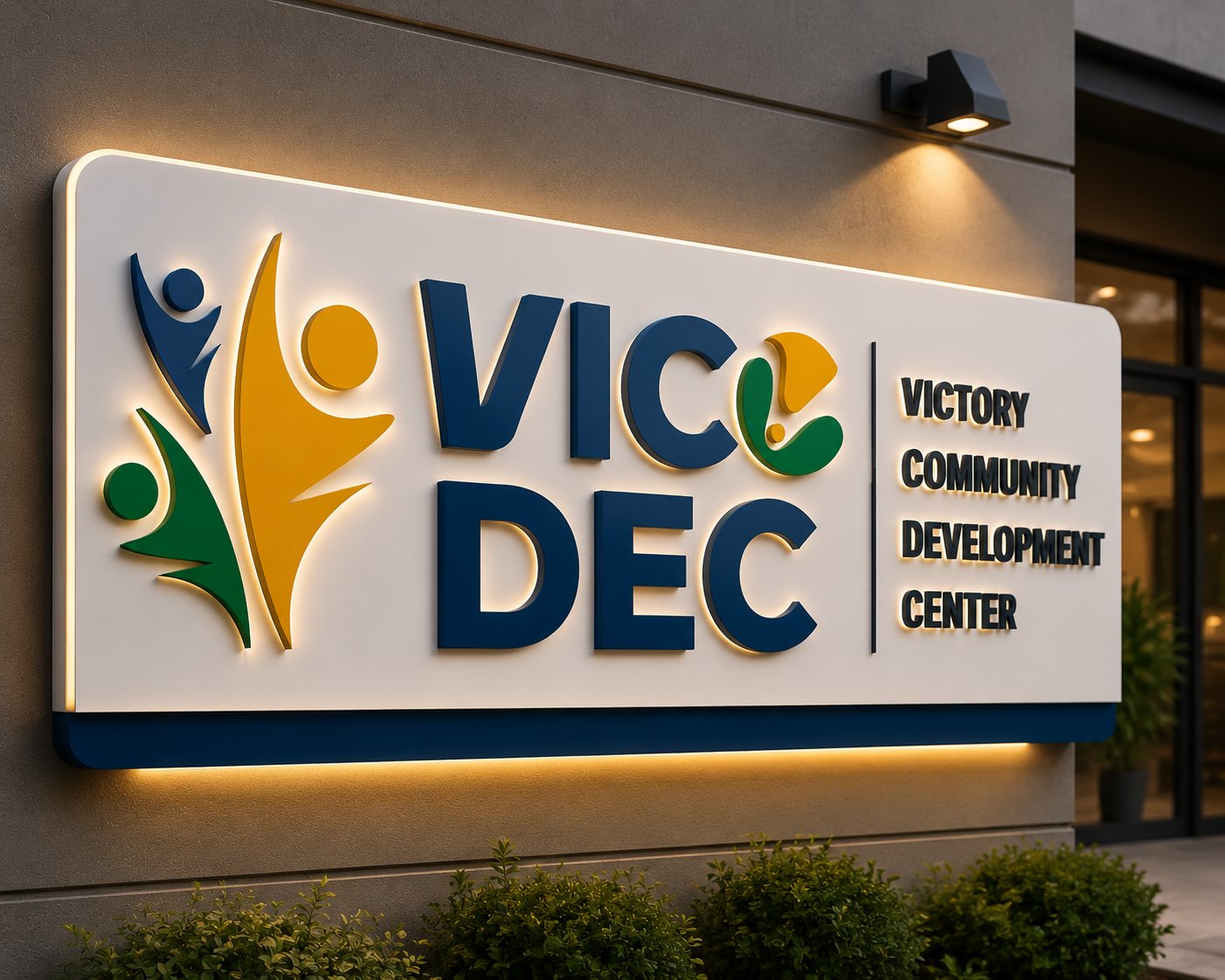
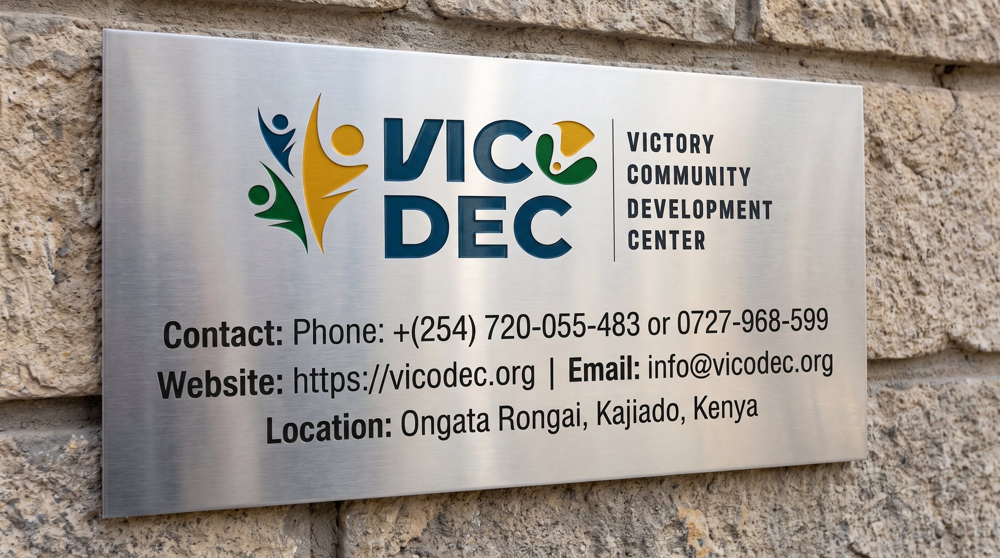
- Building and wayfinding signage
- Uniforms, sportswear and medical wear
- School and clinic stationery
- A multi-page website, designed and built
Credits
Rebrand, brand system, print and website design and build